The Air Quality Index doesn’t make any sense
19 Jun 2023Have you ever felt a little hazy on what the Air Quality Index (AQI) actually means? I have, which is why I decided to deep dive on it. What I found was a bizarre Frankensteinian metric emerging from a web of federal judges, EPA employees, interest groups, and random members of the public.
The first thing to know about AQI is that it is different for every country. I’ll focus on the US version.
The second thing to know about AQI is that it aggregates levels from different pollutants in an unusual way. There are separate AQIs for PM2.5 (small particles), PM10 (coarse particles), Ozone, CO, SO2, and NO2. The overall AQI is just the maximum of the pollutant-specific AQIs. So when you hear that overall AQI is 140, you won’t know which of the pollutants was the cause. I’ll focus on the PM2.5 version here.
The third thing to know about AQI is that the relationship between AQI and PM2.5 is a fascinating case study in how decisions are made at federal agencies. This is the focus of this blog post.
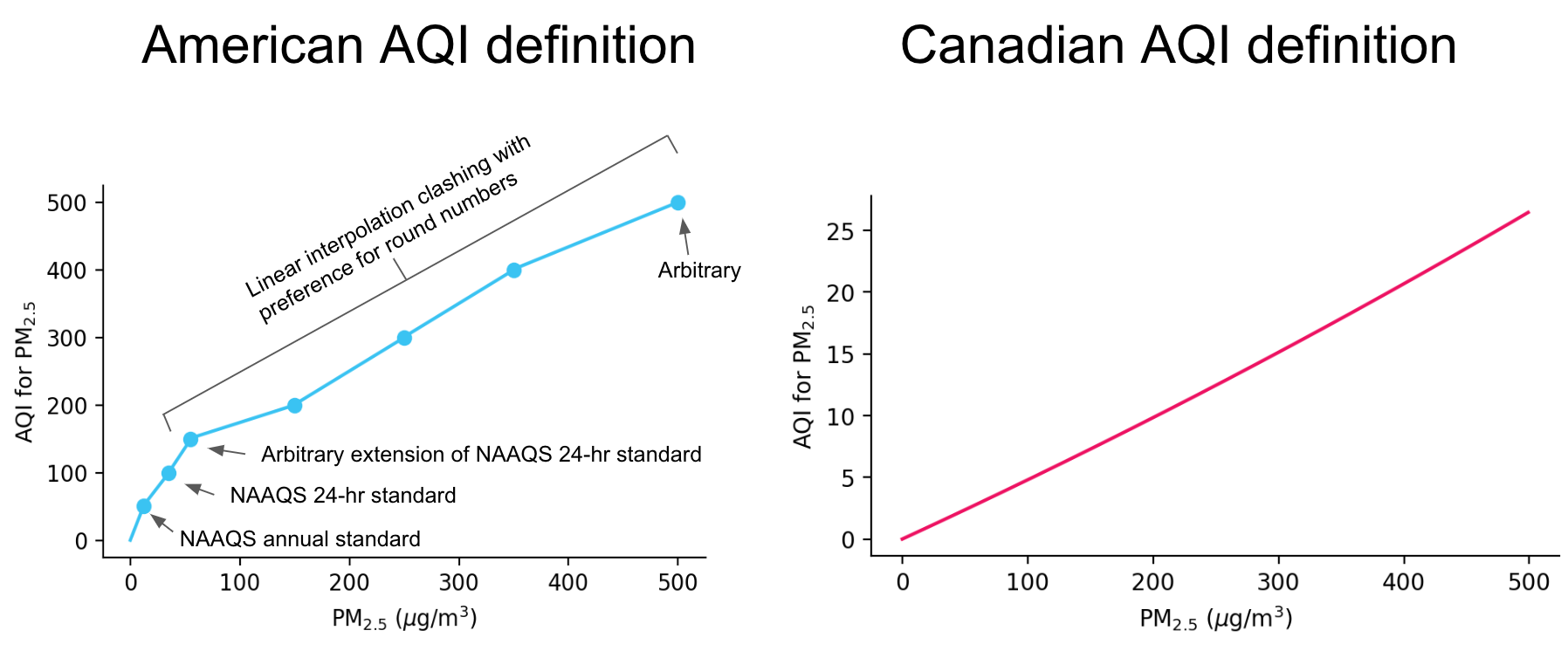
Based on the AQI calculation rules, the relationship between PM2.5 and AQI is defined like this.
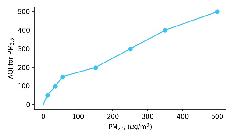
It’s a piecewise linear function composed of seven breakpoints, likely a holdover from when people used hand-held calculators and did not have access to software. That’s fair enough. But what’s really odd is that the curve is wiggly!
There is no physiological reason that the relationship between PM2.5 and air quality should decrease, then increase, then decrease, then increase, and then decrease again.
To investigate, I turned to the latest (2012) revision of the National Ambient Air Quality Standards (NAAQS) for Particulate Matter, which is used primarily to set air quality standards that have some legal force, but secondarily to inform the AQI. The justification for each breakpoint is laid out in over 200 pages. This is what I learned:
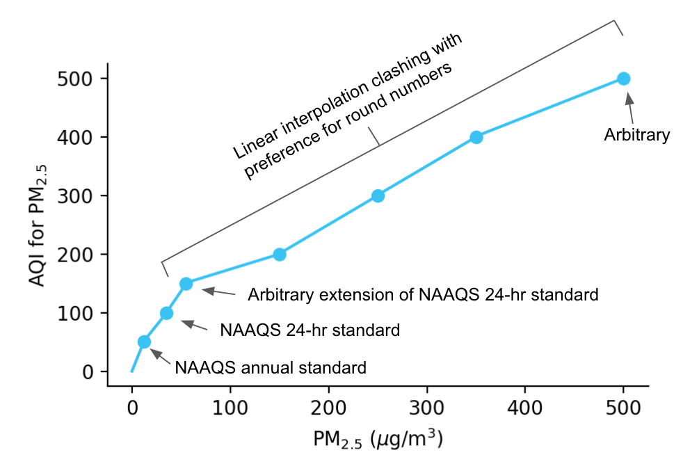
The first breakpoint: 12 μg/m3
The first breakpoint is defined as the annual NAAQS standard, which is the PM2.5 level each U.S. state is required to attain, when averaging over a year. Up until 2012, the standard was 15 μg/m3, based somewhat arbitrarily on the empirical average of PM2.5 values in the US. But after a lawsuit from the farm lobby, a federal judge remanded the standard. After multiple public hearings, testimony from 168 individuals, comments from 230,000 members of the public, and a review of the scientific literature, the EPA decided in 2012 to reduce the value to 12 μg/m3, moving it in the opposite direction of what the farm lobby wanted.
The second breakpoint: 35 μg/m3
The second breakpoint is defined as the 24-hour NAAQS standard. As far as I can tell, there is no principled reason that this breakpoint should be based on the 24-hour standard while the first breakpoint was based on the annual standard, except that the 24-hour standard is stricter.
The third breakpoint: 55 μg/m3
This breakpoint was based on an arbitrary scalar extension of the 24-hour standard (p. 3181). Since no interest groups or members of the public objected to it, the EPA codified it.
The last breakpoint: 500 μg/m3
This breakpoint was initially picked somewhat arbitrarily. Since no interest groups or members of the public objected to it, the EPA codified it.
The other breakpoints
The EPA decided that the breakpoints between 55 and 500 μg/m3 should produce a linear relationship to AQI. Unfortunately, this clashed with their preference for round number multiples of 50, which is why there are elbows at 150 and 350 μg/m3. In a world with software, I don’t understand why there is any benefit to round numbers. But even weirder, if there were any benefits to round numbers, they are partially nullified by the EPA’s inexplicable decision to append a decimal point of 0.4 to each cutoff, so that the actual breakpoints are 55.4, 150.4, 250.4, etc.
Here’s the graph again with annotations.
The authors of the EPA report are thoughtful public servants who are keenly aware that they must manage multiple stakeholders. They know the NAAQS standards face litigation and must be backed by pages of justification. And they realize that not every outcome will make perfect scientific sense.
And in some ways, the wiggliness of the AQI curve doesn’t matter that much. It’s basically a linear function with some mild deviations, and I’m not sure how much the public would actually benefit from smoothing it out.
But still, I can’t shake the feeling that our AQI curve represents a failure of government process. There is no principled reason why annual and 24-hour NAAQS standards – representing two different durations – should be points on a curve that represents point-in-time air quality. The only justification I could find was that it is the “historical approach” (p. 3180). Nor is there any reason for the clashing mix of linearity and rounding used at higher concentrations.
Better ways are possible. The Canadians use a modern exponential curve for their AQI metric. So if Canada is going to share their air with us, maybe we could also share their AQI standards. Or perhaps we should abandon the notion of AQI altogether and just report the raw components (PM2.5, Ozone, etc) individually, just like we do with temperature and humidity.