
Coronavirus and fragmented data pipelines
14 Apr 2020Anybody looking at coronavirus data right now must feel very confused. The UK has a daily case count 60 times higher than Australia. Italy has a case fatality rate 3 times higher than nearby Greece and 12 times higher than Pakistan. These heterogeneities seem massive and have the potential to teach us critical insights about the disease. But as any epidemiologist will readily acknowledge, these statistics are terribly confounded by inconsistent reporting protocols and variable testing ability, both of which could be driving inter-country differences of 10x or more.
In this blog post, I want to talk about some of the enormous issues with data quality and why we have them. And I want to describe how we can go beyond merely acknowledging the biases, and instead focus on the policy changes that can fix them.
Testing count
The first issue is that different countries and different states vary greatly in how much testing they do. Iceland has tested 10% of its population, whereas India has only tested 0.1% of its population. Obviously these differences in testing will drive differences in reported case counts.
Given differences in economic development, it’s understandable that different countries will have different testing counts. What’s not acceptable is that so many countries don’t report their testing counts! They just report the number of positive tests! Even among the countries that report both numbers, many greatly underreport the testing count because they rely on commercial labs that do not provide these records.
This isn’t just an issue for developing countries. Looking just at the United States, economically advanced states like California, Washington, and New York, have not regularly reported their total number of people tested. New York has, at various times, started and stopped reporting negative results.
If we wish to make sensible comparisons of infection rates across regions, it is utterly important to know how many people were tested in each region, especially if there may be 10x or 100x test rate differences across regions. I do not want to be too critical here, but it is astonishing to me that we cannot produce this data.
Mix shift in reasons for testing
It is not enough to report just the number of tests and the number of positive results. To estimate the true infection rates, we must also know why each test was done. Imagine one country only tests symptomatic people, whereas another country tests symptomatic people and high risk non-symptomatic people (e.g. health care workers). And imagine that both countries do the same number of tests. Even though both countries do the same number of tests, you can’t calculate the true infection count by simply dividing the positive tests by the test rate. That’s because the two groups will have different positivity rates, which means your positivitiy count will depend on how much of your testing goes to each group. For a reasonable estimate, you need to divide the positives in each group (or “stratum”) by the testing rate in each stratum, and then sum them up.
The CDC case report form has a field for why each test was done (Figure 1). Unfortunately, many states do not use this form and instead use their own form. (To be fair, some states like Washington use a more comprehensive form, but there is still a lack of standardization.) Moreover, none of the states to my knowledge report the total number of people in each stratum (tested and untested), which would be necessary to do a stratified analysis.

Figure 1: A section from the CDC case report form which could be used for stratification.
Why don’t we do this already?
None of this is groundbreaking stuff. Epidemiologists know about stratification and are keenly aware of the limitations of crude infection counts and crude case fatality rates.
This isn’t a knowledge problem. Instead, this is caused by some combination of three factors.
First, there is a natural tendency among data professionals to focus more on modeling than on upstream data quality issues. My own field of data science is certainly guilty of this. I am not saying data quality has received no attention. I am just saying that if epidemiology is anything like data science, then data quality issues get less attention than they deserve.
Second, our public health infrastructure is fragmented in a very particular way. Internationally, the WHO has no jurisdiction over individual countries and can only ask them to “consider reporting” their data. In the US, the Tenth Amendment requires most public health work to be run by the states rather than the federal government, and the CDC can therefore not compel states to report data or to use its forms. This is clearly a collective action that people have warned about for decades.
Third, it’s really hard. It is currently quite onerous to fill out a report for negative results, although one could imagine a world where negative cases were easy to report.
The three levels of data org maturity, and a dream for the future
In my field of data science, you can determine the maturity of data organizations by their outlook on upstream data quality issues. There are roughly three levels.
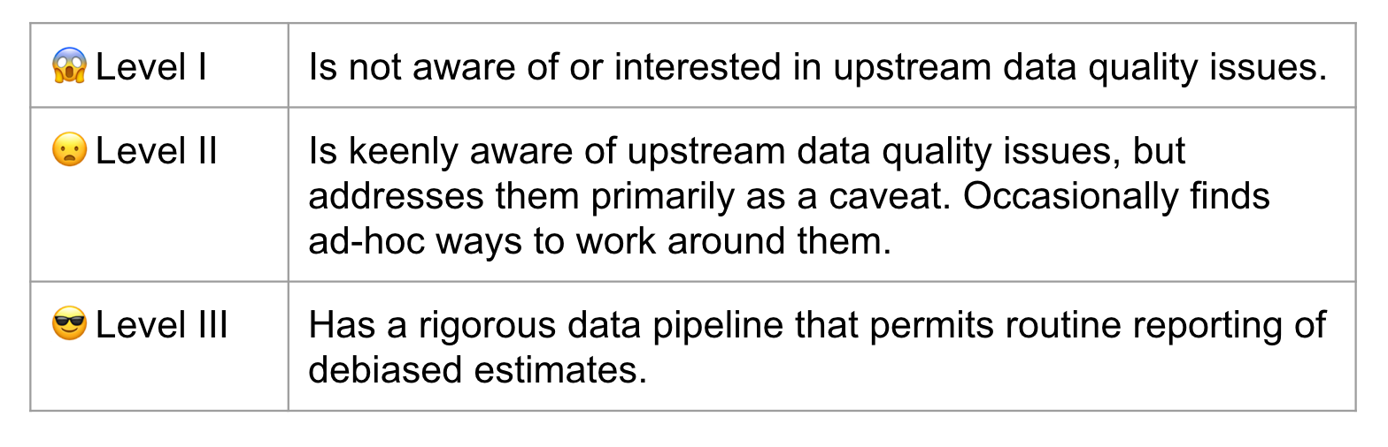
Table 1: Levels of data maturity for a data organization.
Our public health infrastructure is at Level II. My strong belief, and I mean this in as constructive a way as possible, is that Level II is unacceptable. We need to be at Level III before the next pandemic hits.
I want us to live in a world where every country reports positive case counts and total test counts to the WHO, stratified by test reason, and using standardized easy-to-use technology. I want to live in a world where every state reports the same information to the CDC.
How do we get there? Here are some thoughts.
- A cultural shift among researchers towards the hard work on upstream data quality issues. And yes, cultural shifts are possible.
- Financial incentives for better case reporting. For example, while the CDC cannot legally compel states to do adequate reporting, it does provide financial assistance via the ELC Cooperative Agreement. The CDC could use this program as a financial carrot for better reporting, similar to how they have used other cooperative agreements to incentivize participation standards in cancer registries. One can imagine similar financial arrangements at the international level.
- Technology. Even today many health providers fax case reports to state agencies, where someone then converts the data by hand into a CDC report. The CDC is aware of the need for interoperable technology, but clearly this work needs to be prioritized and accelerated.
- Funding for public health agencies to make this all possible.
In the meantime, please consider supporting Our World In Data or following the Covid Tracking Project’s recommendation to contact your state public health authority. Both of these organizations have made a herculean effort to compile incomplete data.