
Comparing the opinions of economic experts and the general public
10 Apr 2016Last week on Marginal Revolution, there was a link to a wonderful paper comparing the policy opinions of economic experts to those of the general public. The paper, by Paola Sapienza and Luigi Zingales, found some pretty significant discrepancies between the two groups. The authors attributed this difference to the degree of trust each group put in the implicit assumptions embedded into the economists’ answers. It’s an excellent and fascinating read. However, like pretty much all academic economics papers, it displays its data in cumbersome text tables rather than figures. In this blog post, I’ve created some figures from the data that I think are easier to read than tables.
For each policy question, the paper provides two numbers. One is the percentage of economic experts who agree with the policy position. The second is the percentage of general public respondents who agree with the policy position. This sounds like a good opportunity for a scatter plot:
There’s a light negative correlation (r = -0.47) between how much economic experts and the general public agree with these positions. As shown in the bottom right, the vast majority of economists prefer a carbon tax to car emissions standards, whereas the vast majority of the general public prefers the reverse. As shown in the top left, the vast majority of the general public believes that requiring the government to “Buy American” is an effective way to improve manufacturing employment, whereas the majority of economists do not. For the exact wording of the questions, see the Appendix to the original paper.
Another way to visualize the same data is with a slopegraph. Below, the left column shows all the policy positions ranked by agreement from economic experts. The right column shows the same policy positions ranked by agreement from the general public. This type of plot vividly shows how unanimous the experts are on a few beliefs: It’s very hard to predict the stock market, we’re on the left side of the Laffer Curve, and the US economy is fiscally unsustainable without healthcare cuts or taxes hikes.
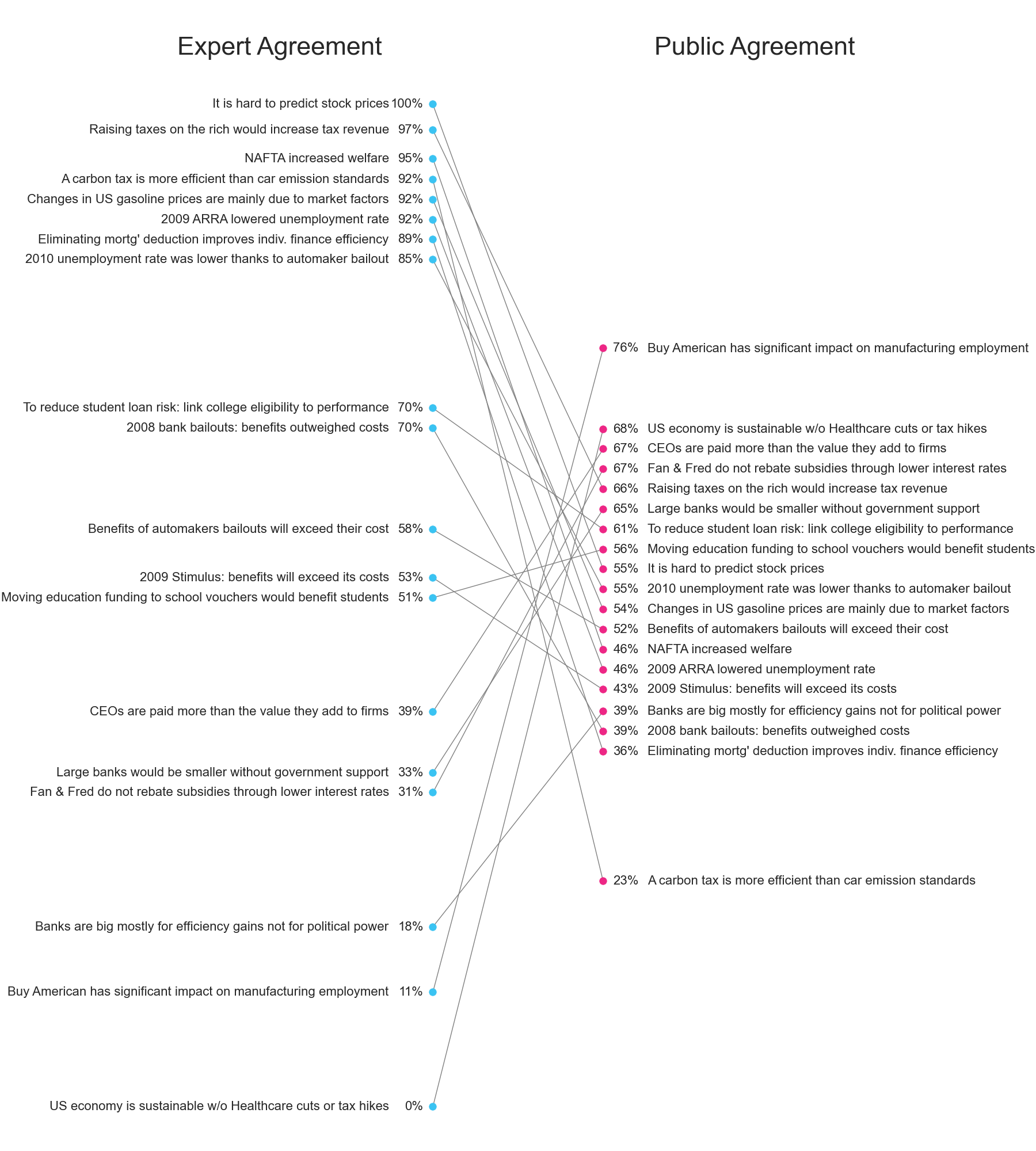
Slopegraphs are useful in this context because they create less text overlap than scatter plots. With the scatter plot above, I had to use interactive mouseover events to selectively show the text for individual data points. This wouldn’t be possible in a publication, since most economics journals still require static PDFs.
Even with a slopegraph, there is still some risk of overlapping text. To keep this from happening, I added some light repulsion to the data points.
For those interested, the experts in this dataset come from the Economic Expert Panel, a diverse set of economists comprising Democrats, Republicans, and Independents. This panel is the same panel that generates the data used in my Which Famous Economist website.
[Python code for the slope graph. Scatter plot is in page source.]